
How to choose a graphic design team in Kerala
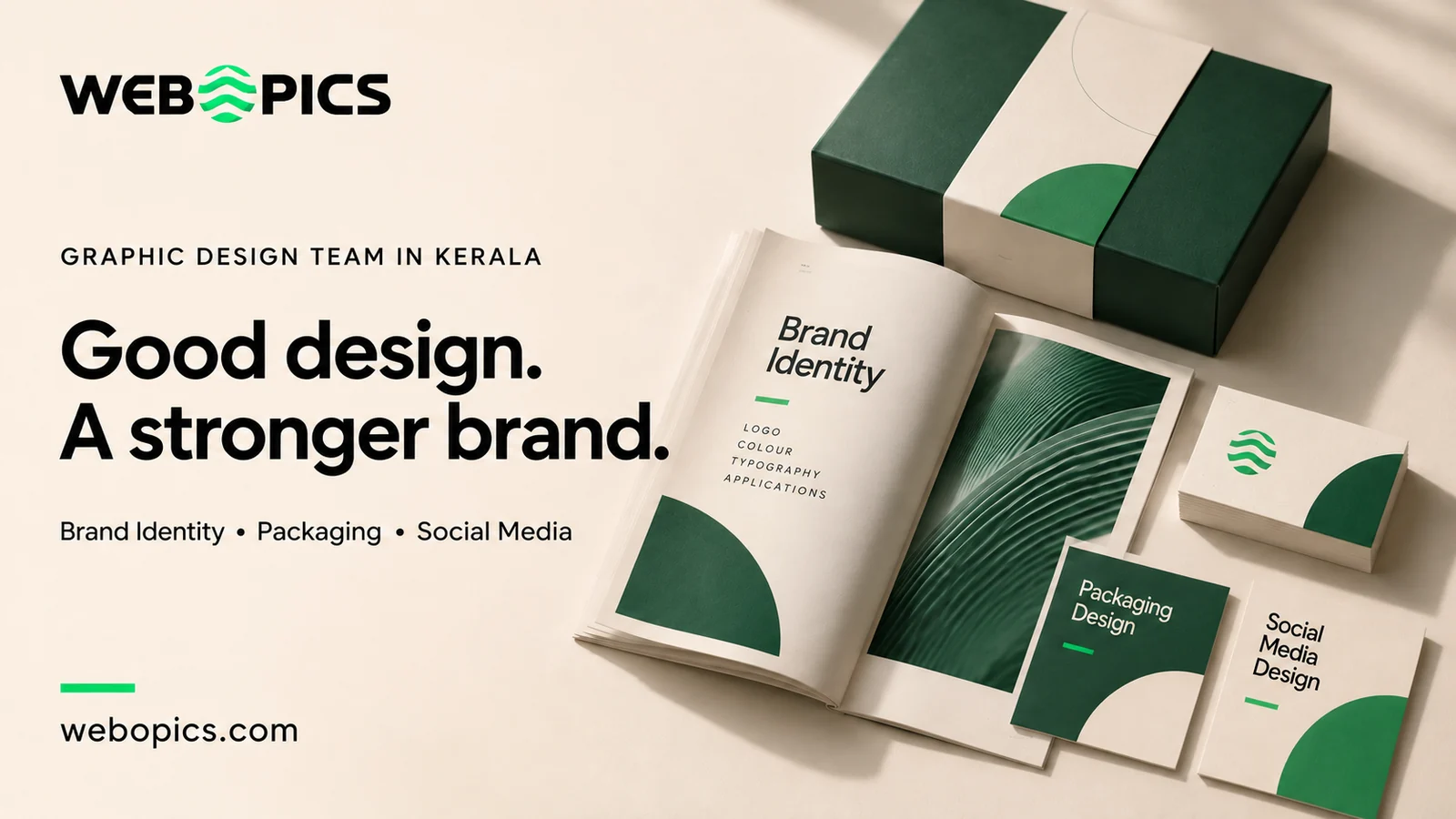
Put your packaging, your last ten Instagram posts, your brochure and your website side by side. If they look like four different companies, the problem is almost never the individual pieces. Each one was probably fine on its own. The problem is that nobody wrote down the rules, so every new piece got designed from scratch by whoever was free that week. Choosing a design team well is mostly about finding people who build the rules, not just the artwork.
Here is what to look at, in the order it actually matters.
Read the portfolio past the mockups
Most design portfolios are mockups: a logo floating on a shopping bag, a box rendered at a flattering angle, a poster on a clean wall. Mockups are easy. They prove somebody can make an attractive image in Photoshop. They do not prove the design works.
Two things tell you much more.
Does the same brand appear across several pieces? One striking image is a design. The same brand holding together across packaging, a brochure, a sign and a feed is a system. Consistency is the harder skill and the one you are actually buying.
Did it get produced? Ask whether print-ready files were delivered, whether the packaging reached a shelf, whether the sign was installed. Production is where designs fail. A dieline that looked fine on screen turns out to need a different glue flap. A colour that glowed on a monitor prints muddy. A design team that routinely hands off production-ready files has solved problems that a mockup never reveals.
A logo is not an identity
This is the single most expensive misunderstanding in small business design.
A logo is one mark. An identity is the system around it: the typefaces and the sizes they are used at, colour values specified for both screen and print, spacing rules, what the mark does on a dark background, how it behaves at thumbnail size, and what changes when it goes on a box rather than a webpage.
Buy only a logo and you have bought one file. Every future piece is then improvised, and six months later your packaging and your posts have drifted apart. That drift is what sent you looking for a design team in the first place.
Typography, hierarchy, and why Malayalam changes the brief
Typography is not decoration. It is the order in which a reader takes in information. Hierarchy means the most important thing is seen first without the viewer having to work it out. On a shelf you have perhaps two seconds, so the product name, the flavour and the quantity need to be readable in that order and at arm's length.
If your customers read Malayalam, this decision gets harder and it gets harder early.
Most Latin display typefaces have no Malayalam counterpart. Malayalam's conjunct characters also need more vertical space than Latin, so a line that sits comfortably in English can look cramped in Malayalam at the same point size. If bilingual text is added at the end of a project, the two scripts usually end up fighting each other on the layout.
So decide at the start whether you need Malayalam at all. A product sold through local retail across Kerala often benefits from it. A D2C brand shipping nationally may not need it anywhere. Either answer is fine. Deciding late is what causes the trouble.
Requirements change by medium
The same brand has to survive very different conditions. A design team that treats all three the same will get at least two of them wrong.
| Medium | What the design must survive | What to check before approving |
|---|---|---|
| Packaging | Shelf distance, handling, a printer's tolerances, being photographed by customers | Print-ready dielines, how it reads from two metres, the design on the actual material rather than a render |
| Print and brochures | Being read closely, in sequence, usually by someone already interested | Body text legibility at real size, margins that survive trimming, a print proof before the full run |
| Social media | A thumb moving at speed, a small screen, muted sound, cropping | How it reads on a phone rather than a laptop, whether the message survives without the caption |
Does the team understand your business?
A good design conversation starts with your customers, not your preferences. The useful questions are who buys from you, what they compare you against, what stops them buying, and where this design will be seen. If the first conversation is mostly about colours you like, the output will reflect your taste rather than your market.
Three illustrative situations, none of them a client project.
A furniture showroom running monthly campaigns. The need is not one beautiful poster. It is a template system so that twelve campaigns a year look like one brand while carrying different offers, and so whoever is at the desk can produce the next one without the brand slipping.
A food brand going into retail. The pack has to work at shelf distance against competitors, carry the legally required information, print correctly on the chosen material, and survive being handled. Here the dieline and the print proof matter more than the mockup.
A service business whose brochure confuses people. This is usually a hierarchy problem rather than a prettiness problem. The work is deciding what the reader needs to know first, second and third, then designing to that order.
What a useful brief contains
You do not need a designer's vocabulary to write a good brief. You need to answer these clearly.
- What the piece is for, and what should happen after someone sees it
- Who it is speaking to, and what they already think of you
- Where it will appear, at what size, printed or on screen
- What must be included: logo, legal text, contact details, offers
- Brands you admire, and specifically what you admire about them
- Anything that is fixed and cannot change
- Who gives final approval, and who else needs to see it first
That last point prevents more delay than any other. Work that goes through three approvers in sequence takes three times as long and usually arrives somewhere blander than where it started.
Deliverables, revisions and ownership
Settle these in writing before work begins.
Deliverables. Exactly which files, in which formats, at which sizes. A logo should arrive in vector, not only as a JPEG, or you cannot use it on a sign.
Revisions. How many rounds are included and what counts as one. Changing a headline is not the same as changing the whole direction, and a quotation should say which is which.
Timelines. Ask for a schedule that separates the design work from the time you need for feedback. Client approval time is usually the longest stage and the least planned for.
Ownership. Clarify whether you receive editable source files or only exports. Then clarify the fonts separately, because this is the part that catches people out. A typeface licensed to the designer does not automatically transfer to you. If nobody checks, you find out when you print at volume or run advertising.
What moves the cost
Design pricing varies because the work varies. The things that genuinely change it are the number of deliverables, whether an identity system is being built or a single piece designed, how many rounds of exploration you want before narrowing down, whether illustration or photography is needed, how many languages are involved, and whether production files and print management are included.
A cheaper quote often excludes the parts that become expensive later: source files, production-ready artwork, or the rules that keep future work consistent. Compare what is included, not only the number.
One project, or ongoing support?
A one-off project suits defined work with a clear end: an identity, a packaging range, a brochure.
Ongoing support suits a business publishing regularly. If you need creative every week, the risk is not any single design. It is drift. Fifty posts made across a year by different hands slowly stop looking like the same company, and the fix costs more than continuity would have.
How to evaluate us
We are a branding and design studio in Kannur, working with brands across Kerala, India and the Gulf. Rather than asking you to take that on trust, here is what you can check against the criteria above.
Our published work includes identity and packaging systems built as systems rather than single marks. The Eclivio identity carries a logomark across poly mailers, a rigid gift box, woven apparel labels and stationery. The Grove Stay rebrand runs from the logo through brochures, check-in collateral, key cards and a signage-ready system. The Burfi.in packaging in Wayanad was delivered as a four-colourway wrap sleeve with print-ready dielines handed off production-ready, and art-directed to hold up in real in-hand photographs rather than only in studio renders.
That last detail is the one we would point you to, because it is the test described earlier in this article. Judge us the way you would judge anyone: look at whether a brand holds together across pieces, and whether the work was actually produced.
Checklist before you hire
- Seen the same brand across at least three different applications
- Confirmed work was produced, not only mocked up
- Clear on whether you are buying a logo or an identity system
- Decided whether you need Malayalam, English or both
- Deliverables listed by file type and size
- Revision rounds defined, with what counts as a revision
- Timeline separates design time from your approval time
- Source file ownership agreed in writing
- Font licensing checked and confirmed transferable
- One named approver on your side
Common questions
What is the difference between a logo and a brand identity?
A logo is one mark. An identity is the system that tells anyone how to use it: typefaces and sizes, colour values for screen and print, spacing rules, behaviour on dark backgrounds and at small sizes, and what changes on packaging versus a website. Buying only a logo is what produces a brand where packaging, posts and brochures look unrelated.
How do I judge a portfolio if I am not a designer?
Look for the same brand across several pieces rather than one striking image. Consistency is harder than a single good mockup and tells you more. Then ask whether the work was produced: print-ready files delivered, packaging on a shelf, sign installed. A mockup proves a design existed. Produced work proves it survived a printer and a budget.
Do I need my designs in Malayalam as well as English?
It depends on who buys from you and where. Products sold through local retail across Kerala often benefit from Malayalam on pack. A D2C brand shipping nationally may not need it. Decide early, because the two scripts have to be chosen together. Most Latin display faces have no Malayalam counterpart, so adding it late rarely sits well.
Who owns the design files afterwards?
Agree it in writing before work starts. Clarify whether you receive editable source files or only exports, and separately whether the fonts are licensed for your commercial use. Font licences are the part most often missed. A typeface licensed to the designer does not automatically transfer to you.
Should I hire for one project or ongoing support?
A one-off project suits defined work with a clear end, such as an identity or a packaging range. Ongoing support suits a business publishing regularly, where the real risk is drift. If you produce creative every week, continuity is worth more than any single design.
Talk to us about your project
If something specific prompted this, a pack going into retail, a brochure that is not landing, or a brand that has drifted, tell us what the piece is for and where it will appear. That is usually enough to work out the scope.
How we approach identity and packaging · the Oma's poster series · work for restaurant and food brands
Message us on WhatsApp or call +91 70128 12012.